After changes in leadership over the past year, Greenwood Wildlife has elected to modernize our look with an evolution of our current brand. We aim to realign our internal efforts and better guide our every day at the Center.
Our mission is largely the same: to provide compassionate care to orphaned, injured, and sick wildlife. We envision a community where wildlife and humans can thrive in our urban environment. Our core values of expertise, community, and compassion help shape this mission.
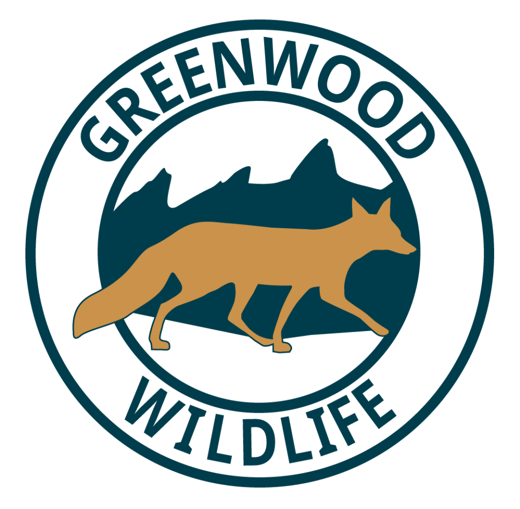
Logo Shifts
Greenwood took time to consider our logo and how we want to be represented. We already have so many amazing people in our circle, so we wanted our logo to look similar but with minor tweaks. We distinguished the Flatiron Mountains, one major symbol in our community. We added some movement to our fox since we hope all of our wild patients trot, scurry, or fly back into their natural habitats.
Color Changes
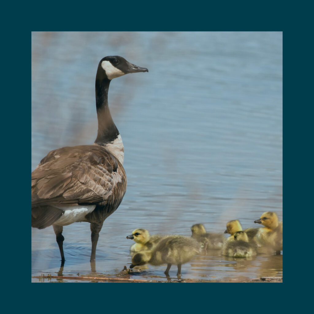
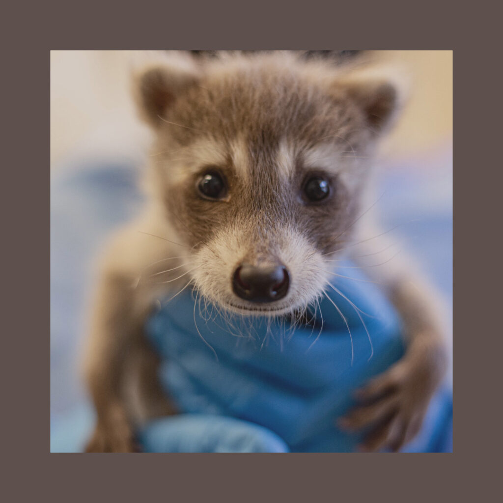
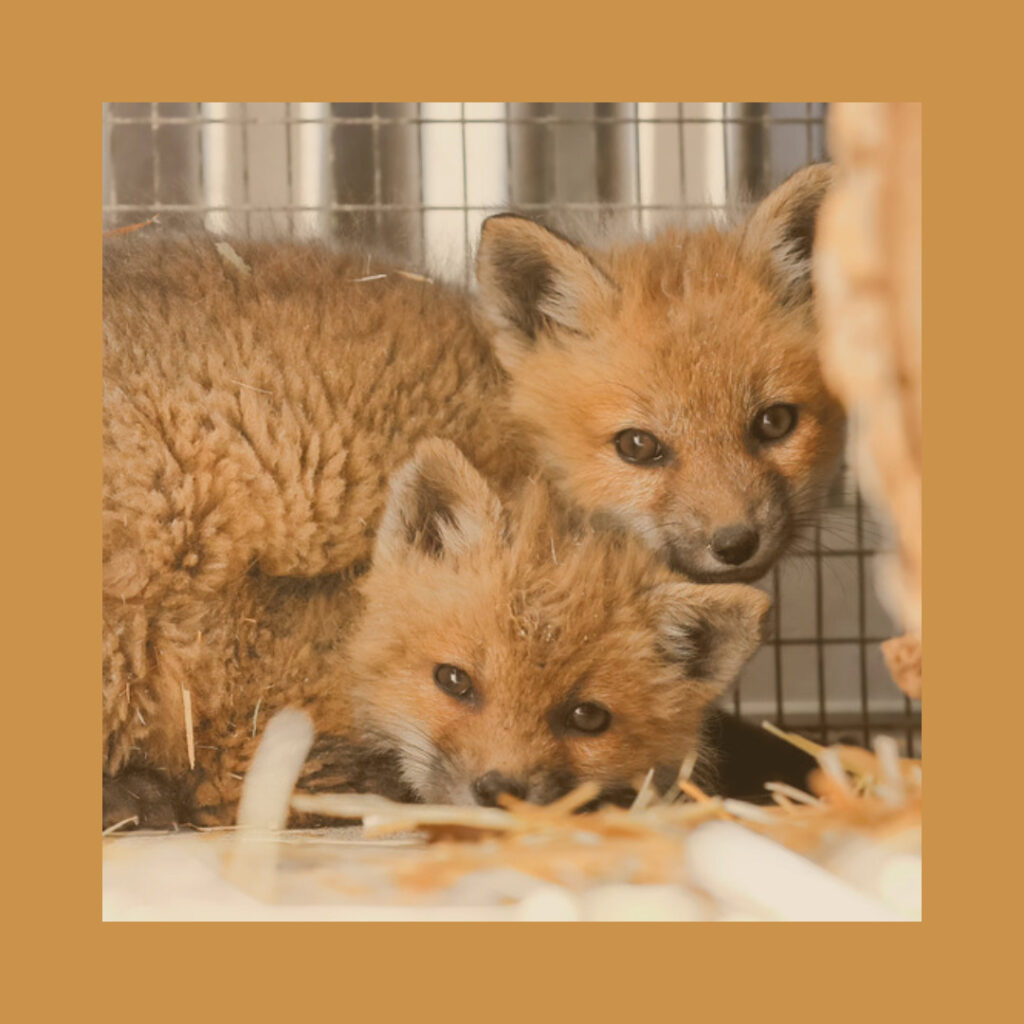
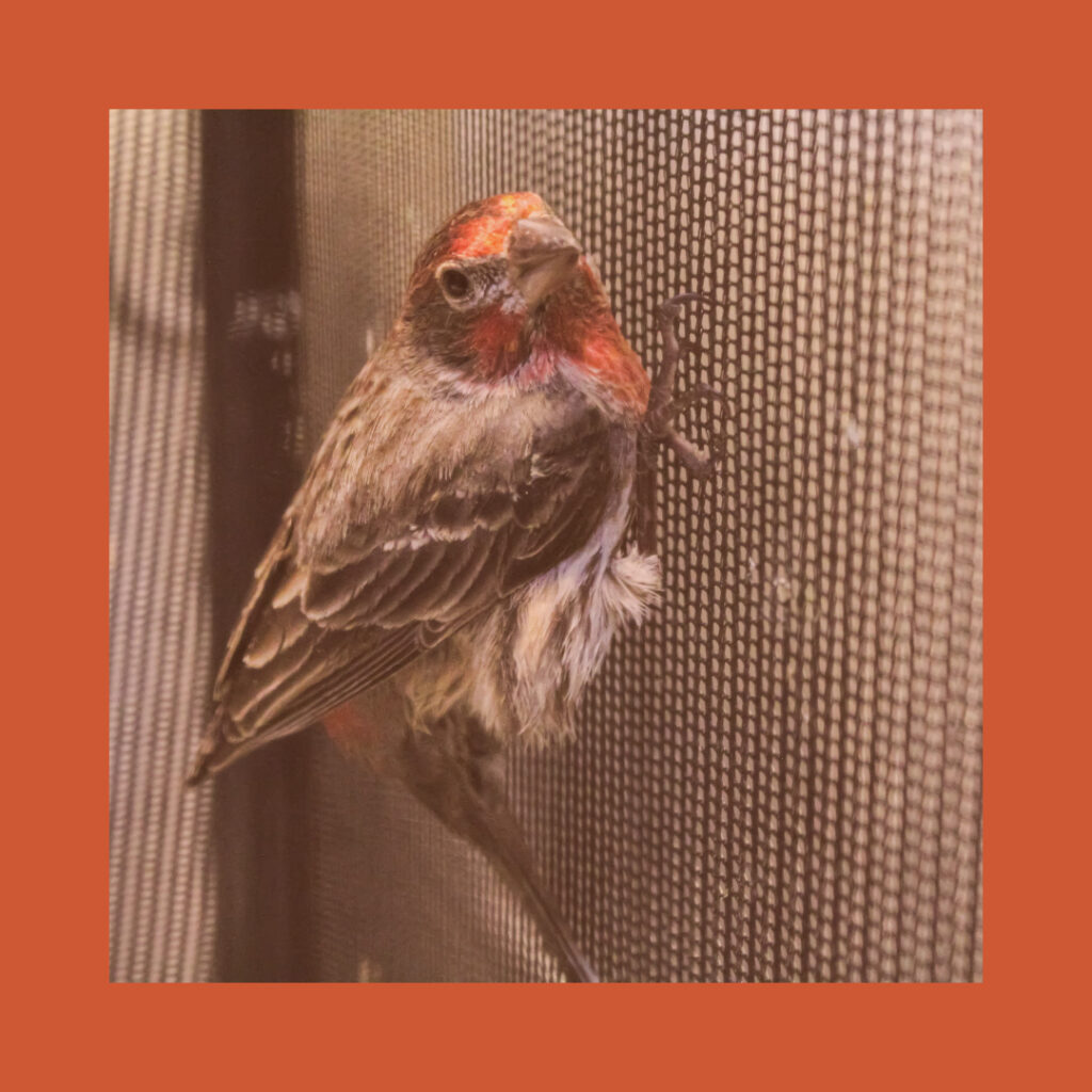
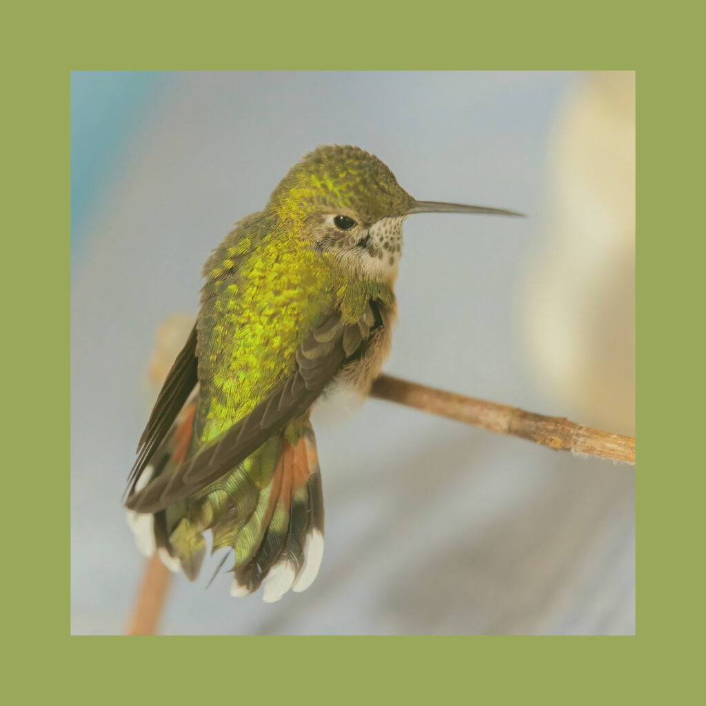
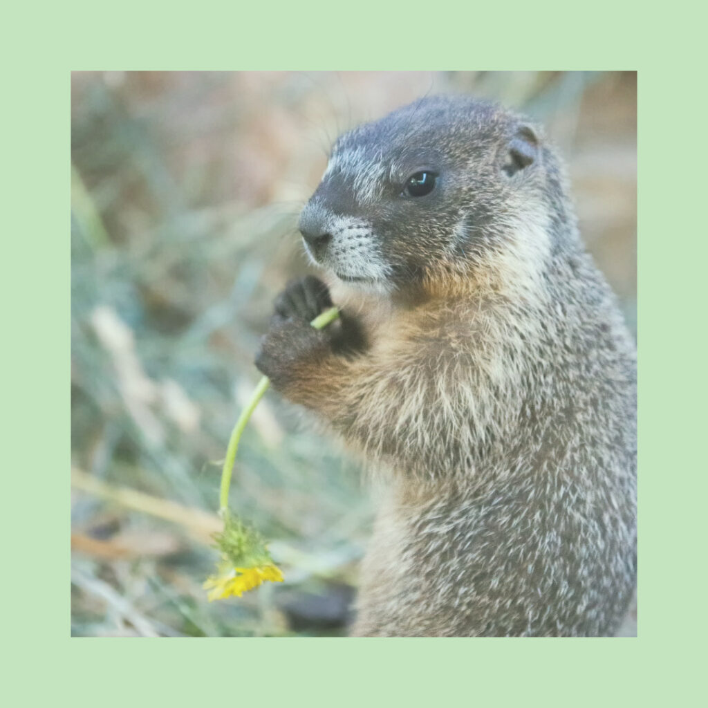
Our mission to rehabilitate and release Colorado wildlife is the foundation of our new color palette, which features many of our patients and their natural habitats.
Primary Colors
Secondary Colors
A Haven for Wildlife in Need
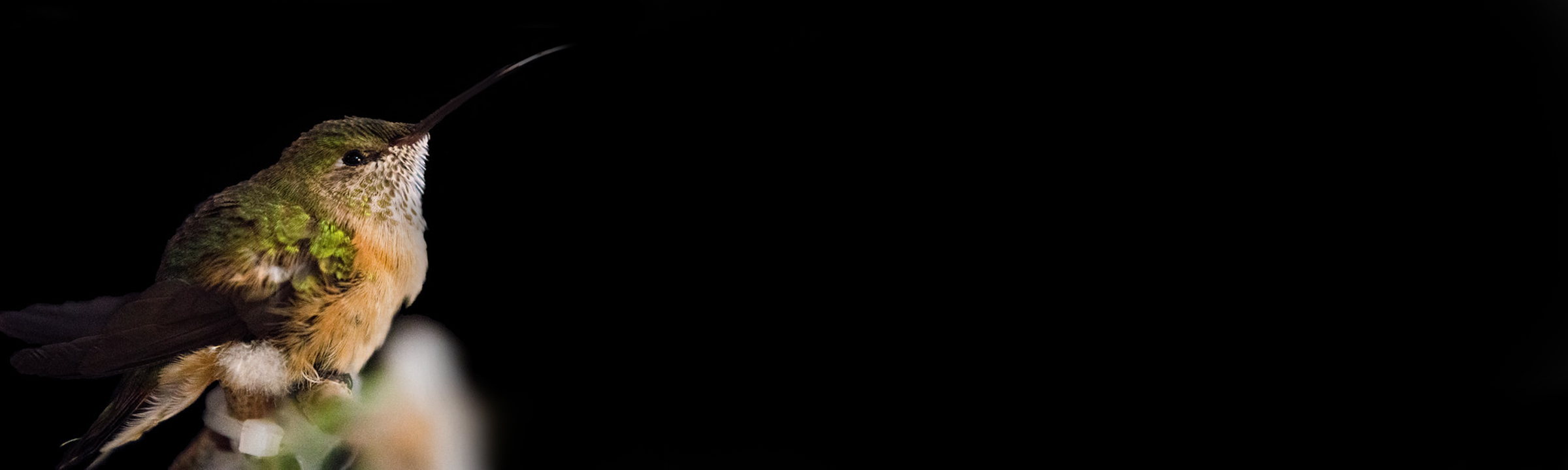
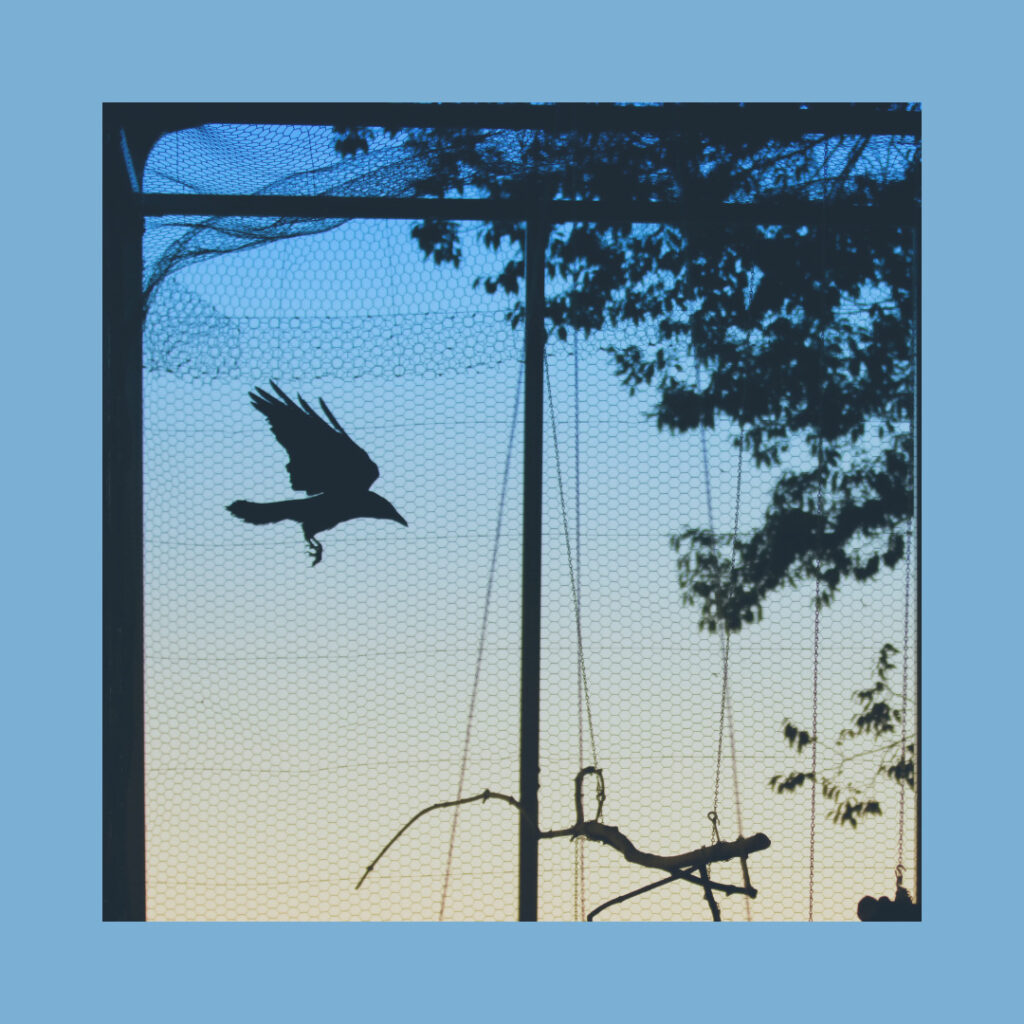
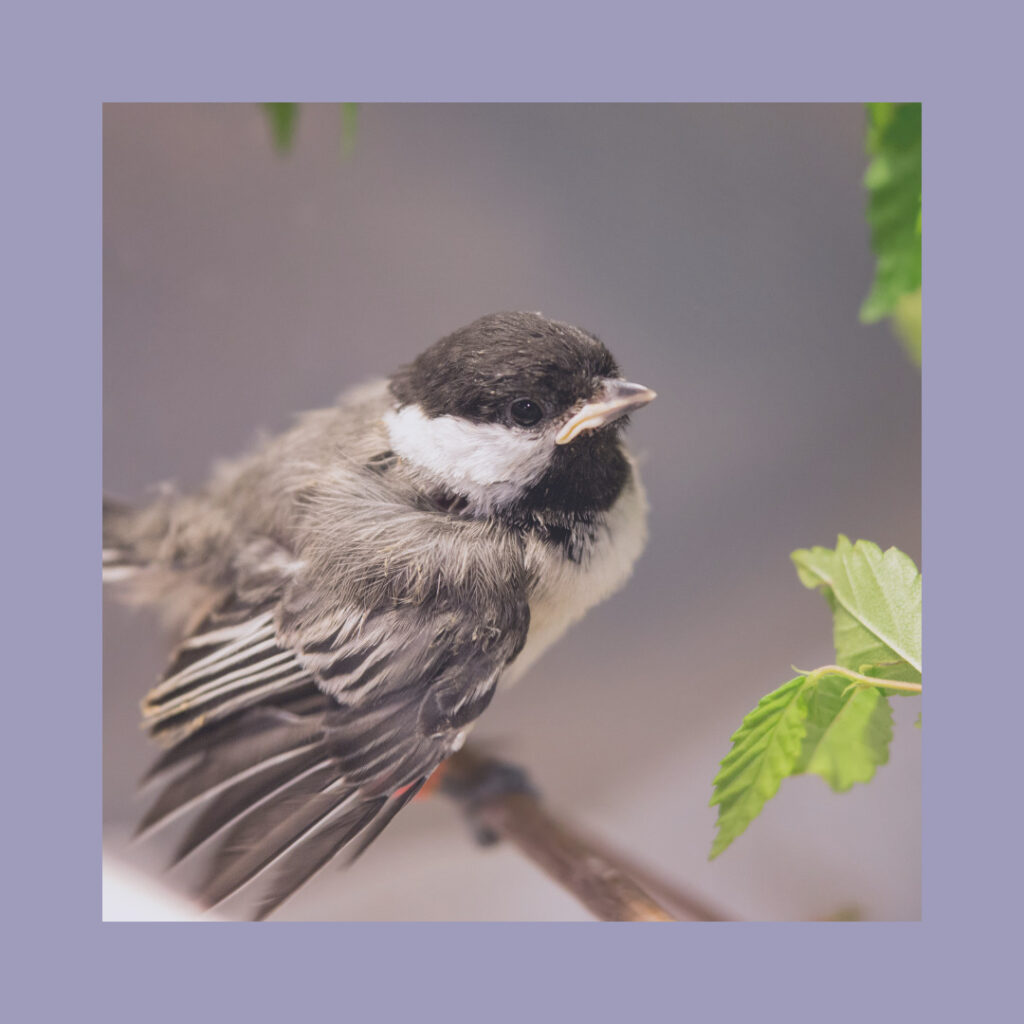
After over 40 years of service, we are a trusted and established rehabilitation center on the Front Range, caring for hummingbirds to coyotes. Greenwood is ‘A Haven for Wildlife in Need.’